
DEV HAY-Brand identity
Dev Hay Mobile Applications approached us for a brand identity wanting to bring the same energy that this young business owner has but into his visual identity, this is how Inka Creative Studio achieved this vision!
The Process
In discussion and getting to know the client it was so important to learn about the messaging that he wanted behind his brand, what are the motivations and what drives the company to do what he does in his day to day business.
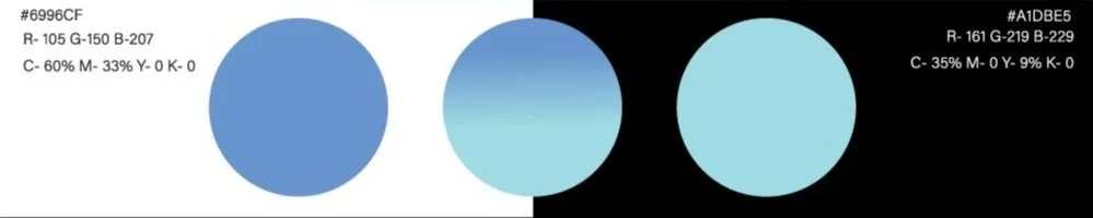
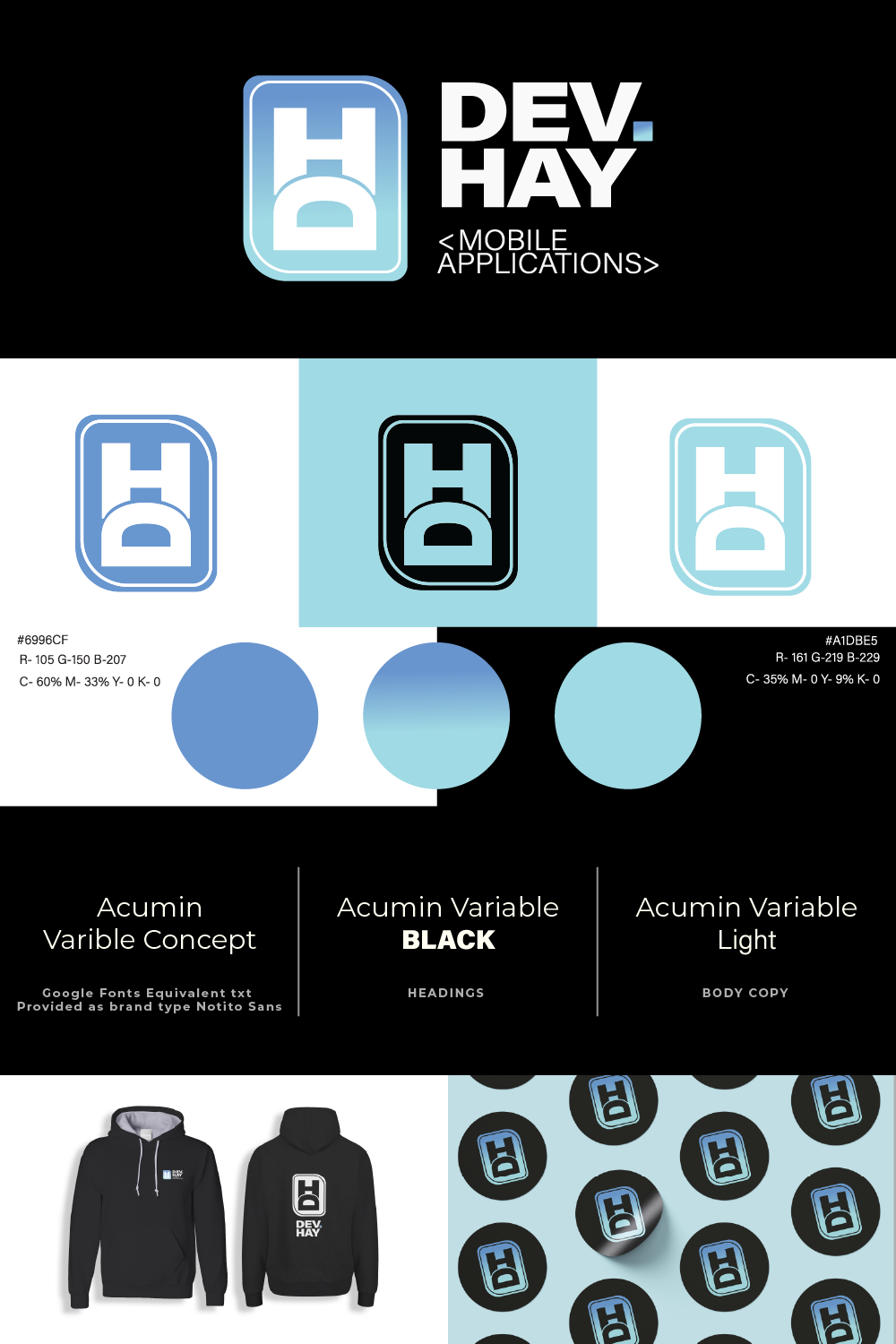
We opted for a rounded logo mimicking that of a computer processing chip, a rounded letter shape with in making use of negative space and clean curves throughout. One of the biggest decisions in this project was the colours our client wanted, this communicates the energy and welcoming of his brand to possible clients a calming and soothing blue gradient seemed to the trick.
The client has received excellent feedback from their peers and the identity has been applied well across all applicable platforms with seeming success. We thoroughly enjoyed working with the Dev Hay team in the creation of this excellent little project and we look forward to what they achieve in the coming years!
Interested in Your Own Project With Us?
Get in touch today