
What is a Brand Identity!
What, Why & How we can help yours!
Your brand identity is how your brand presents itself across your marketing, tone of voice, packaging and everything in between! It is an essential part of building a coherent and strong brand that is recognisable and easily remembered by people who encounter your brand.
We have worked with many business owners closely to learn about their motivation, mission statement and energy behind what they do. We are strong believers that the brands that succeed the best are the ones who have an identity that truly represents what they do and the drive behind it.
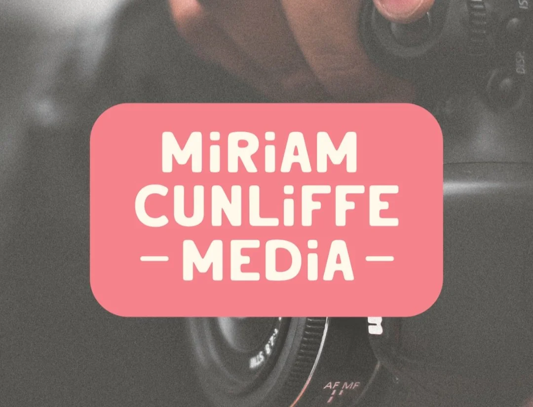
Miriam Cunliffe Media- Recent Brand identity
An excellent example of a strong and recognisable brand identity that Inka Creative Studio have developed is this project done for a Photographer and PR professional in the Midlands. We have used the below features to build an strong and recognisable brand that truly represents the clients energy, motivations & more!
Colour Palettes
One of the most influential features behind a brand can often be the colours that are used in the primary brand logos, secondary and even logo marks across as all branded stationary and assets. Even your marketing needs to have the same balance as your brand guidelines, if you are unsure ask your designer or studio about your Primary, Secondary and maybe even Tertiary applications!
Colour has the ability to carry subliminal emotions and can communicate important information about your brand from sustainability, luxury or affordability. It can even carry unfavourable conditions too as some colour pallets can exclude audience groups due to accessibility in contrast mixtures and even negative monochrome pallets and overly exuberant colour schemes.
Typography
The typeface that you select for your logo through to your body text and headers is very much something all brands need to consider. There is fundamental rules that need to be followed by individual designers, studios and DIY business owners, from text weight, kerning and the ocmbinations behind the type styles.
Serif- Serif typefaces are often associated with older texts, prestige and luxury, some of the best known typefaces that are serifs are Times New Roman and Baskerville. It is a big no no to have A serif header mixed with a serif body as this doesn’t produce the best hierarchy and can make text harder to read.
Sans-Serif- Sans-serif literally translates to Without Serif, this came into the largest popularity in 1990’s and onwards. This is the text that doesnt have the “flare outs” and variations in the fundamental letter shapes. One of the most famous and widely used typefaces that is Sans-serif is Helvetica which is used internationally for signage, documents and brands due to its exceptional readability and clarity.
Sans serifs are often best paired with different weight variants between header and body text as well as with a serif headers too, sans serifs are excellent when it comes to body text due to its fundamental regularity across the letter forms.
Decorative- This is one of the typeface groupings that are very misunderstood and often misused, decorative typefaces for example are like script handwritten type faces, these are typefaces that do not fit into either Serif or Sans-serif. These are best paired with Sans-serifs as mixed with serif type can be overwhelmed and lost to a user.


Don’t Know Where to Start With your Brand Identity
At Inka Creative Studio we have helped many business owners build up their identity and give them the tools they need to maintain their consistency across all applications of their branding.
Understanding what makes a brand identity strong is a complex balance of lots of things, we are true believers of working with businesses not just for them. We can help you build your identity if you have a rough idea or even if you are starting from scratch! Get in touch and lets have a chat today!